Welcome to our mid month reveal and the announcement of our May winners.
We'd like to especially thank our sponsors for May, Julie from Shop and Crop, James from Alacraft, and Julie from Time to Create.
Alacraft is a family business originating from an established bricks-and-mortar store and stocks a range of quality materials including lace, ribbon, yarn, scrapbooking supplies, stickers, iron-on motifs, quilting fabric, craft flowers and much more.
Check out Alacraft today!
Time To Create is a family business. We share a passion to create, share and develop the best that we imagine! We only stock products that we use and believe in. Our stock is always priced at the keenest costing we can do. We support Australian manufacturers and many Australian suppliers and try to have as wide a variety as possible.

As a family business Shop and Crop strive to bring you all the latest from the Scrapbooking and Papercraft Industry, all our staff are very experienced and talented scrapbookers...We pride ourselves on great customer service, with a quick turn around of your orders of instock items. We cater to both the online customers and through our store front at 10/335 Hillsborough Road, Warners Bay. We love nothing better than for everyone to drop in, have a coffee on us and browse and enjoy all the great scrapbooking products.
Our TOP 3 winners are ...
Merry who has won a $25 gift voucher from Alacraft.

Chris Sexton who has won a store voucher from Shop and Crop.

Wendy O'Keefe who has won a store voucher from Time to Create.

and our random draw prize goes to Laura Whitaker.
.jpg)
Congratulations ladies.
Could the winners please contact me at jjjustjane@bigpond.com with their postal details. Don't forget to grab our winners badge from the sidebar.
Our Creative Team favourite this month is Elaine who will receive a little something from me.

Next some more fabulous inspiration from our design team using The Jam Session by Max Mannix. Criteria this month is distressing.
We would LOVE to see more entries - think music, old buildings, sitting on a verandah, trips to the country, kids, dogs or just use the colours!
We welcome Wendy O'Keefe to the team with her first upload ...
I
liked the shabby, rustic look of the artwork with its strong colours
and shabby wooden elements. To get a shabby, grungy look I used
distressed paper for the background with stencilling and inking, then
I overlaid it with roughly torn papers. The wooden photo frame, the
barrels and the tree log elements all add to the rustic effect as
well. Finally, I wanted to show that “laid back” relaxed Aussie
attitude and I did this by slinging an akubra over the photo frame
and placing an expensive brass instrument on a rough- cut tree
log. The photo is a few years old and it's of my youngest son playing his trumpet. He doesn't play it as often now as he has taken up the guitar ... and he's still jammin'.
DI
My inspiration came from the nature of the Australian bush with its ochres and browns, the weathered look of the building, the music and trees.
DI
My inspiration came from the nature of the Australian bush with its ochres and browns, the weathered look of the building, the music and trees.
My photo is of an oil painting I have, done by Ken Harris. My mum, when she
was 70, started painting workshops with him and bought this as a gift for
me.
This piece has been done on corrugated cardboard packaging. There has been
distressing of papers, smooshing with inks and stains and stencilling.
MAJA
This month is all about distressing so I have used my distressing tool on all paper edges.
To get that more shabby feeling that is in the inspiration painting I´ve used some brown chalk and I've gone with the music theme.
AUBRIE


MAJA
This month is all about distressing so I have used my distressing tool on all paper edges.
To get that more shabby feeling that is in the inspiration painting I´ve used some brown chalk and I've gone with the music theme.
AUBRIE

So this was one of those crazy pages where I had absolutely no plan. No idea what I was going to do. Because distressing is something I do on nearly every page, this month's challenge was my happy place! I started with the background. That was done by folding and then rolling white tissue (not bleeding tissue, by the way!). I dripped dye on it to create the distressed tie dye effect. I then used matte gel to adhere that page over a thick piece of printed cardstock. The pattern I made with liquid pearls is actually following the pattern from the base paper, which shows through a little bit. I distressed the frame and paper cut out by balling it up and then inking and spraying with water. The cheesecloth "frame" was done by pitting dye on a frame-shaped paper, heavily misting with water, then laying the cheesecloth on top. Then I ripped and cut the cheesecloth.
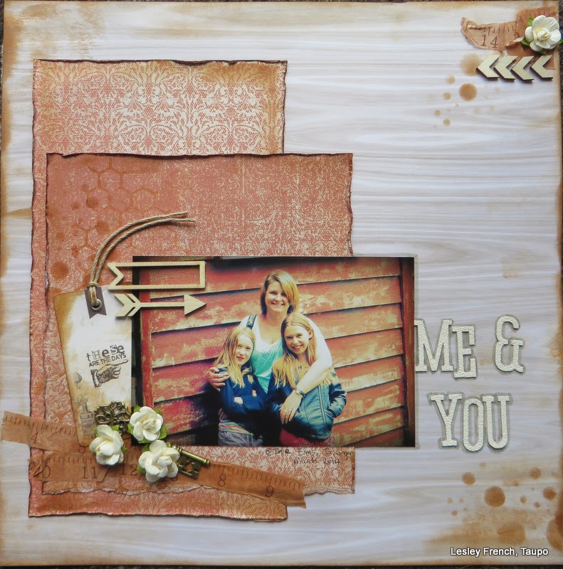
I was really inspired by the wood this month and I found this photo of me and my
girls. I have tried to keep the layout within the same tones with touches of
distress ink all over. I think this gives it a subtle effect.

This painting is all about country and music so naturally I had to marry them both with a layout celebrating THE country music event in Australia - The Tamworth Country Music Festival. I used colours from the painting and ink and paint distressing techniques to create my page.
Now we'd love to see your interpretations of our inspiration this month.
Remember we happily accept all forms of paper crafting for your entry including digital and encourage international submissions. All we ask is that you create an new entry for our challenge although you are most welcome to combine with a sketch and/or colour challenge if you wish. You have until 11.55pm on the last day of the month to submit your entry.
Next week we will be introducing you to our June guest designer, Kripa Koushik.


Wow!!! Thank you very much Artastic, such a great challenge...!!!
ReplyDeleteOh thanks team for your support and votes. Congrats to the winners too.
ReplyDeleteWoohoo! Thanks so much for drawing my name!
ReplyDelete